

To celebrate Weekly Shonen Jump‘s 25th anniversary, Shueisha decided to create a new style event to promote it’s history for the fans. The name of the event was called “Weekly Jump Multi World” and was a exhibition that was held in the Tokyo Dome Prism Hall between July 28th through August 15th, 1993. The event cost 700 yen for admission and guests were able to receive as special booklet which highlighted some of the items on display. The booklet was never available for sale directly.
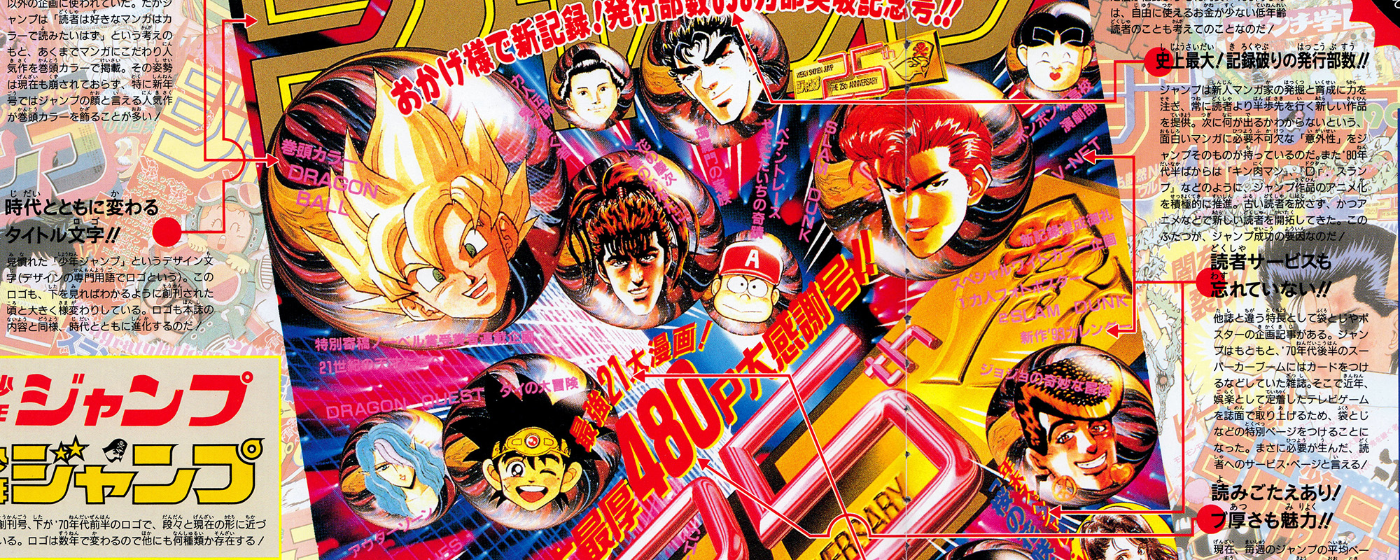
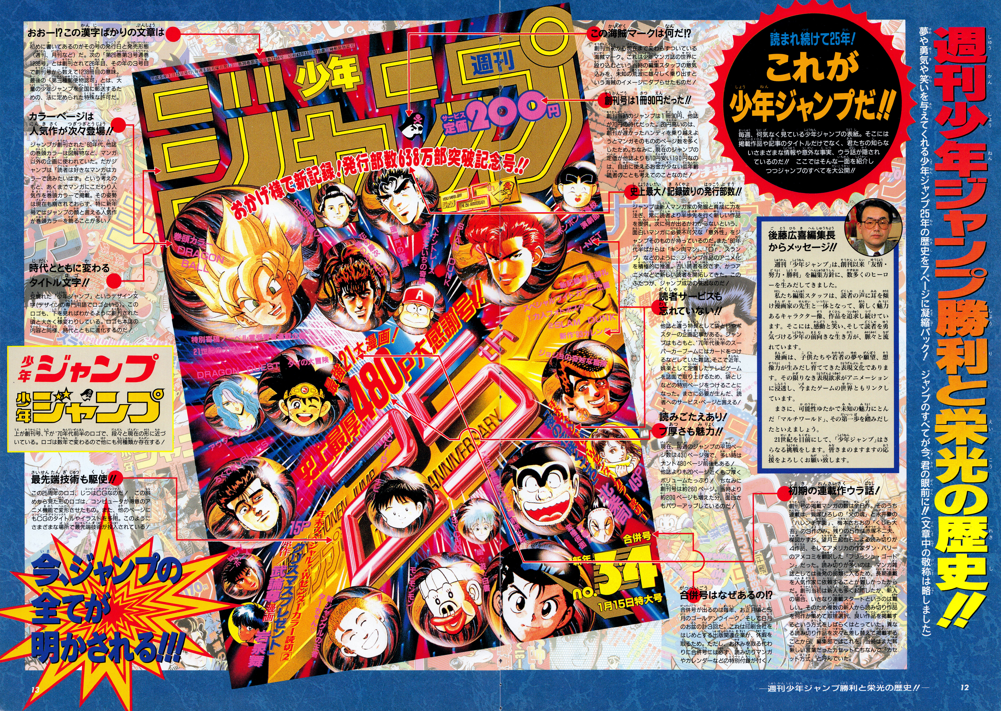
Following the illustrated map of the Jump Multi World event in the booklet, a 2 page article is presented to talk about the history and purpose of unique elements on the cover of a Weekly Shonen Jump issue. Since 1993, a majority of these elements are still similar to issues you can get today.
During this time period, the Editor-in-Chief of Weekly Shonen Jump was Hiroki Goto (後藤広喜). He originally joined Shueisha as an editor for Weekly Shonen Jump in 1970. After many of his series he oversaw became successful he was promoted to Deputy Editor-in-Chief and then promoted to Editor-in-Chief in 1986. In 1993, Hiroki Goto later handed the position of Editor-in-Chief to Nobuhiko Horie (堀江信彦) who held the position until 1996 when he was transferred from the position by Shueisha.
Below is a transcription and rough English translation of the notes listed on these 2 pages. The after the section related to the Editor-in-Chief, the sections will go in order from top-to-bottom on the right page (page #12), followed by the sections listed on the left page (page #13).
A message from Hiroki Goto (後藤広喜編集長からメッセージ!)

週刊「少年ジャンプ」は、創刊以来「友情・努力・勝利」を編集方針に、数多くのヒーローを生みだしてきました。
私たち編集スタッフは、読者の声に耳を傾け漫画家の先生と一体となって、新しく魅力あるキャラクター像、作品を追求し続けています。そこには、感動と笑い、そして読者を勇気づける少年の前向きな生き方が、脈々と流れています。
漫画は、子供たちや若者の夢や願望、想像力が生みだし育ててきた表現文化であります。その限りなき表現欲求がアニメーションに浸透し、今またゲームの世界ともリンクしています。
まさに、可能性ゆたかで未知の魅力にとんだ「マルチワールド」、その第一歩を踏みだしたといえましょう。
21世紀を目前にして、「少年ジャンプ」はさらなる挑戦をします。皆さまのますますの応援をよろしくお願い致します。
Since the beginning, Weekly “Shonen Jump” has created many heroes following the mantra of “Friendship, Effort, Victory.”
The entire editorial staff, and myself, listen to the voice of our readers and work together with the mangaka to continue to discover new and appealing characters and series. These stories are filled with emotion, laughter, and positive messages that resonate with boys and inspires our readers.
Manga, is an expression built into our culture that has been created and nurtured by the dreams, aspirations, and imagination of children and young people. This limitless desire for expression continued into animation, and now extends into the world of games.
This is the first step towards a new “Multi World” full of potential and undiscovered appeal.
As we enter the 21st century, “Shonen Jump” will take on these greater challenges. We look forward to your continued support.
What is this pirate symbol? (この海賊マークは何だ!?)
創刊当初から現在まで変わらずついている海賊マーク。これは少年マンガ誌の世界に殴り込むという当時の編集スタッフの意気込みを、未知の荒波に雄々しく乗り出すという海賊のイメージにダブらせたものだ!
The pirate logo has remained unchanged from the very first issue through today. It symbolizes the enthusiasm and the editorial staff from that time to break into the world of shonen manga magazines, just like a pirate would bravely sail off into the rough and unknown seas!
The first issue was only 90 yen!! (創刊号は1冊90円だった!!)
創刊当時のジャンプは1冊90円、他誌が70円の時代だった。20円高いのは、創刊が遅かったハンディを乗り越えようとマンガそのもののページ数を多くしたため。ちなみに、現在のジャンプの定価が他誌よりも10円安い190円なのは、自由に使えるお金が少ない低年齢読者のことも考えてのことなのだ!
For the first issue of Jump it only cost 90 yen, compared to other magazines at the time were only 70 yen each. This 20 yen was needed to pay for the additional pages and overcome the disadvantage of having a late start for the magazine. Incidentally, the reason why the current price of Jump is 190 yen, 10 yen lower than other magazines, is to help young readers who have less spending money.
The biggest ever! Record-breaking circulation!! (史上最大!記録破りの発行部数!!)
ジャンプは新人マンガ家の発掘と育成に力を注ぎ、常に読者より半歩先を行く新しい作品を提供。次に何が出るかわからないという、面白いマンガに必要不可欠な「意外性」をジャンプそのものが持っているのだ。また’80年代半ばからは『キン肉マン』、『Dr.スランプ」などのように、ジャンプ作品のアニメ化を積極的に推進。古い読者を放さず、かつアニメなどで新しい読者を開拓してきた。このふたつが、ジャンプ成功の要因なのだ!
Jump has always been devoted to discovering and nurturing new mangaka and providing new series that are a half-step ahead of the readers. Jump series have an element of “surprise” that is essential to manga, so you never know what will happen next. Since the mid-’80s, Jump has also been promoting animation of series such as “Kinnikuman” and “Dr. Slump.” This keeps older readers engaged, while bringing in new readers through the anime and other means. These two factors are the key to Jump’s continued success!
Services for the reader are not forgotten!! (読者サービスも忘れていない!!)
他誌と違う特長として袋とじやポスターの企画記事がある。ジャンプはもともと、’70年代後半のスーパーカーブームにはカードをつけるなどしていた雑誌。そこで近年、娯楽として定着したテレビゲームを誌面で取り上げるため、袋とじなどの特別ページをつけることになった。まさに必要が生んだ、読者へのサービス・ページと言える!
One thing that sets this apart from other magazines is the featured articles included in the pages and with posters. In the late ’70s, Jump was the first magazine to include cards during the supercar boom. In recent years however, in order to cover video games, now an established form of entertainment, the magazine includes special articles. This service for the readers was born out of this necessity!
It’s worth reading! The thickness is great!! (読みごたえあり! ブ厚さも魅力!!)
現在、毎週のジャンプの平均ページ数は430ページ強で、多い時はナント480ページ前後もある!他誌よりも20ページ近くもブ厚くボリュームたっぷり! ちなみに創刊号は約260ページ。当時より約200ページも増えた分、面白さもパワーアップしているのだ!
Currently, the average number of pages in Weekly Jump is just over 430, but sometimes it goes up to 480 pages! It’s nearly 20 pages thicker than other magazines, which is already a lot! By the way, the first issue was about 260 pages. Since that time we’ve added 200 more pages, which adds even more excitement!
Why are there combined issues!? (合併号はなぜあるの!?)
合併号が出るのは毎年、お正月頃と5月のゴールデンウイーク、そして8月のお盆の計3回だ。これは印刷会社をはじめとする出版関連企業が、休暇を取るため。ただし、お休みを取る代わりに合併号には必ず、読み切りマンガやカレンダーなどの特別付録が付く!
The combined issues are published three times a year, once around New Year’s, during Golden Week in May, and during the Obon festival in August. This is because our printing companies and other publishing groups take holidays during these times. However, to make up for the break, our combined issues always come with special extras like oneshot manga or calendars!
Secret stories about early serializations! (初期の連載作ウラ話!)
創刊号の掲載マンガの数は全8作。そのうち連載は、貝塚ひろしの『父の魂』と永井豪の『ハレンチ学園』、梅本さちおの『くじら大吾』の3作のみ。残りの5作は赤塚不二夫、楳図かずお、望月三起也らによる読み切りが4作品、そしてアメリカの作家ダン・バリーのアメコミを翻訳した『フラッシュ・ゴードン』だった。読み切りが多いのは、マンガ雑誌としては後発の部類に入るため、長期連載を人気作家に依頼することが難しかったからだ。創刊当初は新人も多く起用したが、新人の場合、いきなり連載スタートというのは難しい。そのため複数の新人から読み切り作品を何作か集めて取捨選択、良い作品を掲載するという方式をしばらくはとっていた。異なる読み切り作品を次々と差し替えて掲載することから、編集部ではこれを、当時はまだ耳新しい言葉だったカセットにちなんで「カセット方式」と呼んでいた。
The first issue had a total of 8 manga stories. Of these, only 3 of them were full serializations, Hiroshi Kaizuka’s “Chichi no Tamashii”, Go Nagai’s “Harenchi Gakuen”, and Sachio Umemoto’s “Kujira Daigo”. The remaining 5 were oneshots from Fujio Akatsuka, Kazuo Umezu, Mikiya Mochizuki, and “Flash Gordon,” which was a translation from the American comic book author Dan Barry. The reason for the large number of oneshot stories was that as a manga magazine, it was launched later than others. It was difficult to ask other popular authors to write another long-running serialization. In those early days, the magazine worked with many newcomers, but it was difficult for them to start a new serialization right away. For this reason, the magazine adopted a policy of publishing several oneshots from various new authors and then selecting the best ones. Since different stand-alone works were published in quick succession, the editorial department called this the “cassette method” after the new word at the time.
Huh!? This is a lot of kanji (おおー!? この漢字ばかりの文章は)
初めに書いてあるのがその号の発行日と発売形態(週刊、月刊など)だ。次の「第26巻第3号通巻1238号」とは創刊されて26年目、その年の3号目で創刊号から数えて1238冊目の意味。最後の「第三種郵便物認可」とは、大量の少年ジャンプを全国に郵送するための、法に定められた特殊な許可だ。
The first piece is the publication date and the release format of the issue (weekly, monthly, etc.). The next piece, “Volume 26, Issue 3, Issue 1238” means that it was the 26th year since the first issue was published, and it is the 3rd issue published that year, and is the 1238th issue since the first issue. The last piece of “Third Class Mail Approved” is the special permission stipulated by law to allow the large volumes of Shonen Jump to be mailed nationwide.
The color pages always have popular series (カラーページは人気作が次々登場!!)
ジャンプが創刊された’60年代、他誌の巻頭カラーは図解物など、マンガ以外の企画に使われていた。だがジャンプは「読者は好きなマンガはカラーで読みたいはず」という考えのもと、あくまでマンガにこだわり人気作を巻頭カラーで掲載。その姿勢は現在も崩されておらず、特に新年号ではジャンプの顔と言える人気作が巻頭カラーを飾ることが多い!
When Jump was first being published in the ’60s, other magazines used their color pages for non-manga project and other illustrations. However Jump believes that “readers want to read their favorite manga in color” and has always published the popular series in color on the opening pages. This policy has not changes even today, especially with the New Year’s issue, which the most popular series being the face of Jump are on the opening pages!
Title characters change with the times!! (時代とともに変わるタイトル文字!!)
見慣れた「少年ジャンプ」というデザイン文字(デザインの専門用語でロゴという)。このロゴも、下を見ればわかるように創刊された頃と大きく様変わりしている。ロゴも本誌の内容と同様、時代とともに進化するのだ!
The familiar design of the “Shonen Jump” letters (called a logo in design terms). As shown below, the logo has dramatically changed since the first issue of the magazine. The logo, just like the contents of the magazine evolves with the times!
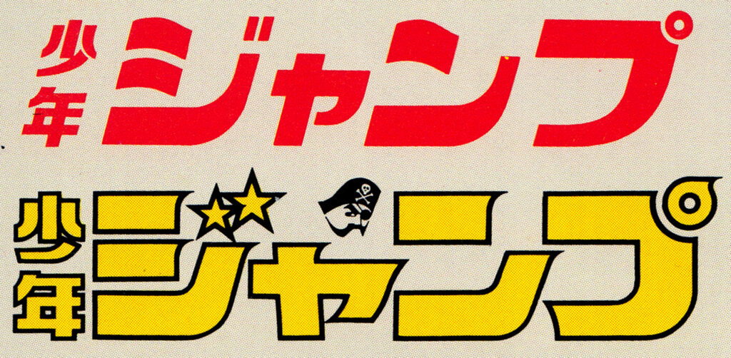
上が創刊号、下が’70年代前半のロゴで、段々と現在の形に近づいている。ロゴは数年で変わるので他にも何種類か存在する!
The top logo is from the first issue, and the bottom one is from the early ’70s, which slowly became like the current logo. The logo changes every few years so there are several other variations!
Utilizing cutting edge technology!! (最先端技術も駆使!!)
この25周年のロゴ、じつはCGなのだ! この斜めから見た形のロゴは、コンピュータが得意のアニメ機能で変形させたもの。また、他のページにもCGのタイトルやイラストを多用。このようにさまざまな場所で最先端技術が投入されている!
This 25th anniversary logo was made from CG (Computer Graphics)! The logo seen from an angle was transformed using a computer’s animation function. CG titles are illustrations are used extensively on other pages too. This cutting-edge technology is being used all over!


